
Sydney May 2013 (2 photos)
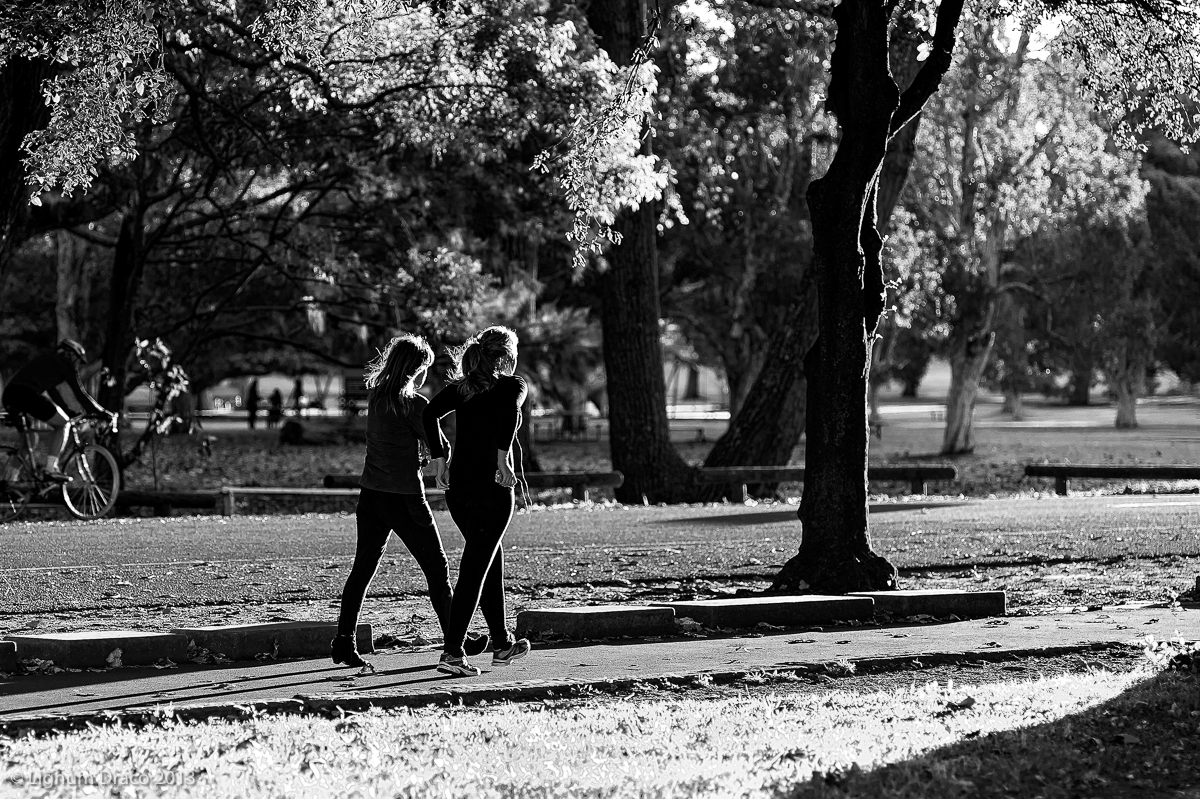
I was out for a walk late in the afternoon and the sun was setting. I saw this glorious patch of light streaming through the trees. So I stopped and chose a suitable vantage point. I had a 90mm manual focus lens and prefocussed to the spot I wanted. Then all I had to do was wait for someone to walk into the light… “welcome to my parlour said the spider to the fly”.
I’ll leave you to decide if you prefer black and white or colour.
It’s the last week of Autumn here and this is the third consecutive instalment of my series of autumn colour and light photos. If you missed the earlier 2 in the series, just look at my last 2 posts until you reach Follow the yellow brick road? .
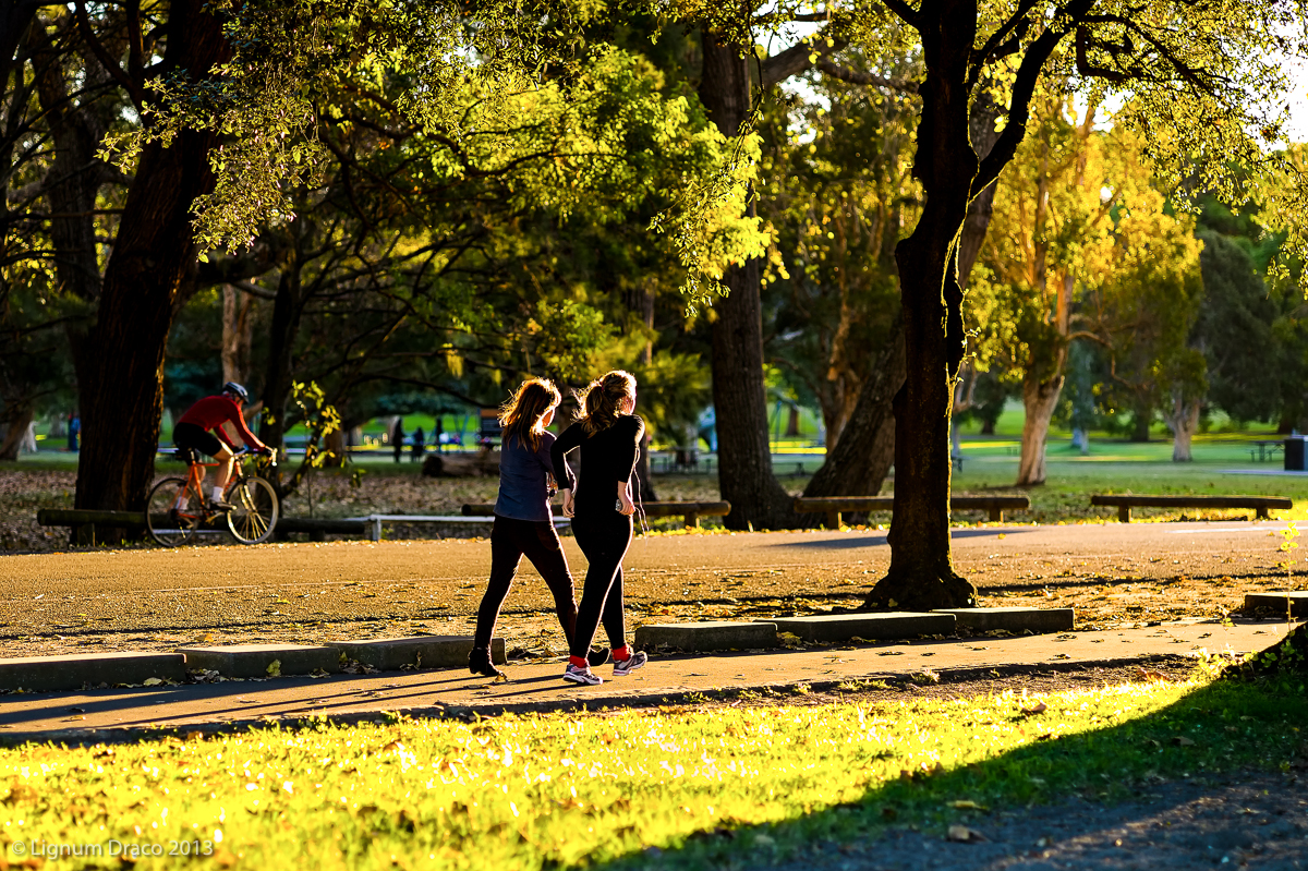

Unusually for me I actually prefer the colour with this Picture, but it’s a good shot either way. 🙂
Thank you. It’s the warm light that adds a bit of magic.
I really noticed the difference between the colored and black and white. One does focus differently on each picture. The brilliant colors are stunning and warm and inviting, but something is missing. With the black and white I get more depth/perception of what I think you want us to see.
Well, no deep thoughts here. lol
I just wanted to tell you I tried to understand.
Several bloggers I follow include the black and white and it is nice. I only point and click. But I often use the Gimp to modify pictures. Usually I color them up, but recently I have been desaturating and the result is pleasing.
Do what you enjoy. )
Thank you m’lady.
The b&w highlights the textures and tones and gives a different emphasis to the photo. The warmth of the light is what made me take the photo.
These photos are so different. I like them both. I liked your last post, by the way, with the horse riders, the first pic especially.
Thank you very much. 🙂
As stand alone pictures either works – but to convey “Autumn” – I’d opt for color.
Completely agree.
the back & white one makes me think to a classical picture : could be shot now as well as twenty years ago, this is something that makes it eternal
Thank you very much. 🙂
Same here! I hardly ever like colour pictures, but this one I prefer! I think its the second one of yours that I like in colour more than bw.
Brilliant as always! And by the way, we got some sun here. Finally!
Thanks. The warm sunshine is what drew me to the scene.
And good to hear you’re enjoying some sun. 🙂
beautiful. i actually like the black and white in this one, i’m always amazed at how beautiful your tones are.
Thank you very kindly.
Your photos are truly special. You know when you’ve taken a great picture when the black and white looks even better than the color version… Very inspired!
You are very kind. Merci beaucoup.
The black and white – great shots, both of them.
Thank you. 🙂
Beautiful shot! So impressive the contrast of light and shadow…Great work.
Thank you very much.
I love the B&W. It draws attention to the highlights on the front of the two women. Although the color is nice it doesn’t move me the same way!
They each have different qualities but I do like silhouettes with haloes.
Many thanks. Have a great week ahead.
Black and white. The contrast makes the photo pop and adds nice depth. 🙂
Thank you. I’m always happy to hear your thoughts.
This is a tough choice, but I think I like the warm tones of the color better.
Great shot!
Thank you. Sometimes I have trouble deciding between which version to go with. Each has a different emphasis.
Your photos are filled to the brim with passion and storytelling That’s one of the many reasons I love them so. you know how much I love the black and white but the color is stunning also.
Thank you Sheri. It’s always a pleasure to hear your opinion and thoughts.